Ever tried on clothes that were supposed to be your exact size, but weren’t what you were looking for? A little too tight on the shoulders, too short on the sleeves—but it might just be the perfect fit for someone else. In our experience, the same applies to data and AI solutions designed for private equity deal evaluation. Sure, a tool might have worked for someone else’s use case, but with millions on the line, you want the bespoke solution. I believe that our job isn’t to "add AI to PE workflows" at all costs, but instead to redesign workflows around what AI uniquely accelerates, while respecting domain expertise.
High stakes, higher expectations
The market’s flooded with AI-based diligence tools, but one size just doesn’t fit all. What works for one fund might steer you in the wrong direction. While PE workflows might seem similar from the outside, firm strategy, deal stage, sector focus, and team structure all influence how you look at a deal.
From the tools’ perspective, the user is betting their credibility on whether this tool makes them look sharper or sloppier in Monday's IC meeting. As a designer, this is your primary constraint. Custom software works when it's designed for the actual job, the actual user under pressure, and the actual limitations of LLMs.
The key to solving this challenge lies in intentionality throughout the entire design process.
Reducing uncertainty with intentional design
No matter how you look at it, investments are betting, and with that comes immense uncertainty. Our job is to create tools that help reduce this by providing the right information in the right context, and answering questions that haven’t even been asked yet.
By this nature, the research phase is more like making assumptions and triangulating possibilities. Stitching together CIM (confidential information memorandum) data, broker optimism, reports, and pattern recognition to form a point of view under time pressure.
This carries several implications for the design process:
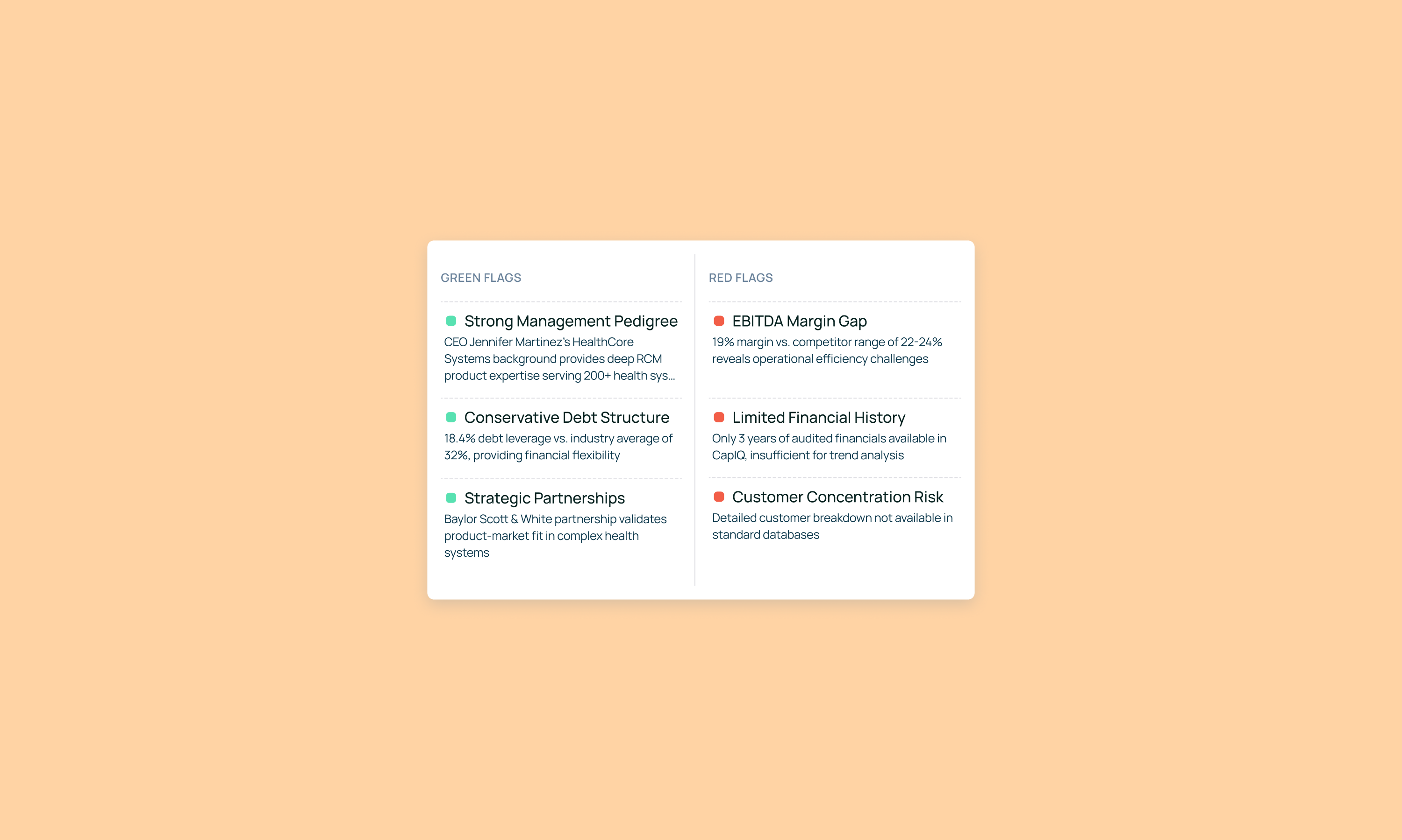
- Instead of just providing answers, the tool must surface hidden insights users might have overlooked (e.g., "60% of this revenue growth came from one customer acquired 8 months ago")
- With PE being full of estimations across varied industries, you have to design for alternatives and separate false confidence. ("Here's the analysis assuming these three things are true - if any are wrong, here's how it changes")
- Time pressure means a need for actionable insights in an already presentable, but editable format.
These implications become our design constraints. They determine which features actually serve analysts under pressure—from how we structure information hierarchies, to how we present source attribution, to whether we even offer a chat interface at all. Every interaction pattern must pass this test: does it reduce uncertainty, or just add another step?
What they also have in common is that all of them require intentionality in design.
Your scope is your user
The first test—as in any design domain—starts with the user themselves: who are you actually designing for?
Design for 2-3 real people doing many different tasks, not personas. Not "private equity professionals" as a category, but specific people with specific jobs to be done under specific pressures. The associate pulling data at midnight has different needs than the VP presenting to the IC, yet they're often the same person six hours apart. Your tool needs to work for both of them without manual reconfiguration. Talk to actual people using your product, and ask them to walk you through their average day.
Focus on discovery questions, such as the most frequent challenges, as well as things they wish they'd known day 2 instead of day 12 the last time. Pay attention to the actual steps in their workflow: when they find information, how do they validate it? What do they do with it next? Where does it go? What outcome are they actually trying to achieve?
As opposed to regular projects where you optimize for engagement, the real KPI here is how fast the user can go from CIM to conclusions, and whether they can skip the Sunday panic session validating AI results (and then just re-doing everything in Excel anyway). The faster the time to conviction, the faster trust is earned.
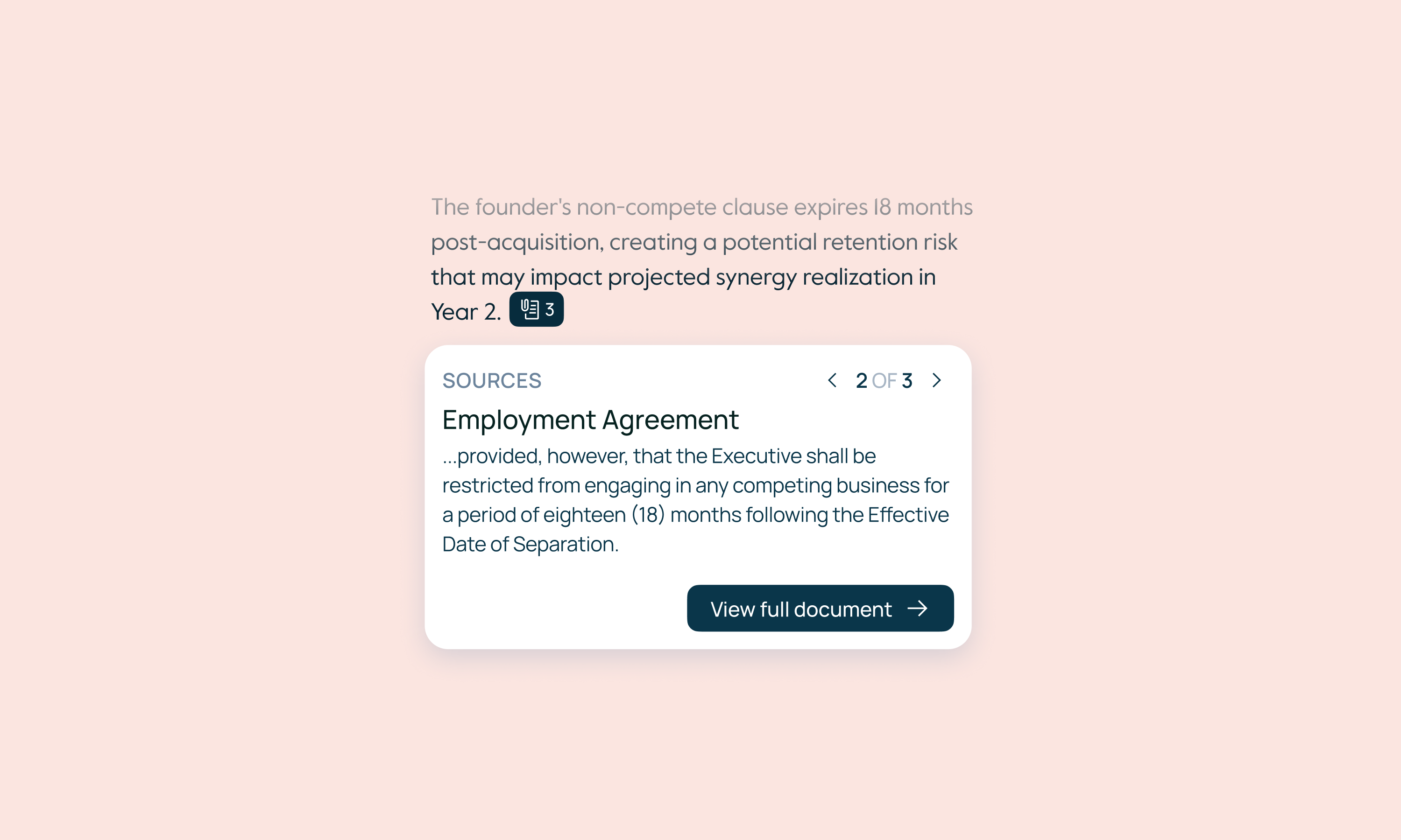
To further build trust, make sure to always highlight sources. Wherever the AI gets its insights from, you need to showcase the source's exact location down to the sentence (ideally side-by-side with the insight panel), so they can verify the findings in seconds.
Context as an objective
With the necessary data being sourced from several different reports and updated regularly, it’s like a crime scene with evidence scattered all over it. CIMs written to sell, Excel sheets with hidden tabs, and reports contradicting each other.
This messy reality means the AI must do more than just analyze data. It must assess data quality while doing analysis, and needs to clearly signal limitations: "This is based on management estimates, not audited financials" or "Manual verification needed here." When information is insufficient or timestamped in ways that matter ("as of [date]" in a 6-month deal process), the AI must flag it explicitly rather than proceeding with false confidence.

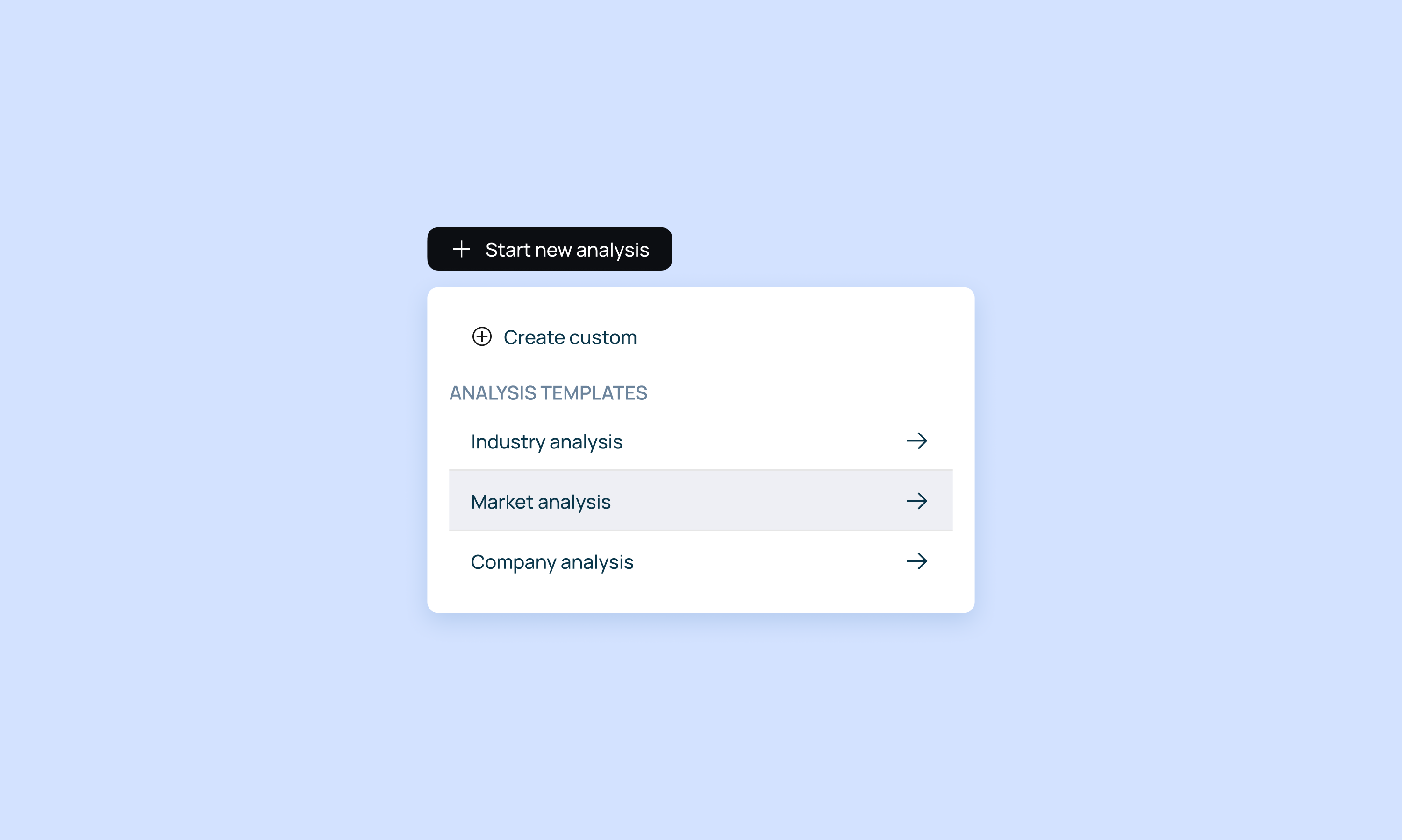
The tool also needs to adapt to different deal types without manual setup. A healthcare rollup and a SaaS growth deal may require different analysis, but users shouldn't have to reconfigure settings every time they open a new project.
In our experience, the best PE tools have almost no user-facing settings—personalization happens in the analysis layer (deal type, sector, stage), while the UI adapts automatically. Think of it like this: we have predefined grids and workflows with prompts and burnt it settings (for output type, model type, or a default layout for the dashboard per each domain), making it easier to onboard, but doesn't exclude the opportunity to customize.
Designing with purpose
But how can UX designers support this ever-changing environment? By questioning every assumption.
Just because a feature exists in other tools doesn't mean your users need it—and the reverse is also true. We've built elaborate comparison grids because competitors had them, only to find users ignored the grid itself, and used it as a bridge to chat with the insights coming from it.
But we've also seen the opposite: teams default to chat interfaces because "that's AI," when what they actually needed was structured displays that surface information proactively rather than requiring them to think of the right questions at 2 AM.
The lesson isn't "chat good" or "grids good", assumptions fail in both directions. What works for one fund's workflow can actively hurt another's. Sometimes it's a chat interface for talking to various documents, but deal teams under pressure often need something more specific. It's up to us to discover what actually serves their workflow, not assume based on what worked elsewhere.
The takeaway is that without user access during design, teams build what somebody wants, not what users need. And a tool that slows diligence or obscures red flags can turn into a bad investment decision —or become the bad investment itself—, so getting this wrong is a significant financial risk, not simply bad UX.
Intentional UX in practice
When your goal is just to add AI to PE investment workflows, you’ll fail more often than not. Our key to success is redesigning workflows around what AI uniquely accelerates, while respecting domain expertise.
A beautifully designed interface presenting flawed analysis is dangerous. This is why everything must be intentional, from the choice of features you build to where you surface information, how you structure interactions, and when you intervene in the user's workflow. Each decision compounds.
Choosing to center chat versus centering the analysis artifact changes how users build conviction. Surfacing insights in a single view versus enabling multiple perspectives affects their ability to triangulate. Even small choices about editing, saving, or showing sources cascade into whether users trust the tool or abandon it for Excel.
These foundations (understanding the job, the user, the context, and validating relentlessly) determine which patterns we choose and why. In the next article, we'll walk you through our specific decisions: not as prescriptions for what "works in PE," but to show how we approach these tradeoffs and what drives each choice we make.