We've all seen this before: an AI tool that works perfectly in a demo but gets abandoned after two weeks. The model is solid, the outputs are accurate, but analysts still copy-paste everything into Excel because the interface doesn't match how they actually work.
This happens constantly in private equity. The technology can extract data from deal documents faster than any human, but if the UX doesn't support how deals actually get done, none of it matters.
We’ve made such tools for major PE firms before, so let’s follow up my previous article on how intentional design helped us create AI tools for PE and look at some more practical examples.
Shift the burden of complexity
PE is inherently messy. Even though some industries let you turn complex problems into really simple designs, in many cases, oversimplifying the design means losing what makes the tool valuable. The complexity of synthesizing management presentations, audited financials, third-party reports, and market data can't just disappear - the design has to match the reality of the work.
Following Tesler's Law of Conservation of Complexity: some complexity cannot be removed. Your job as a designer is to shift the burden of complexity from the parts that waste time (finding information across multiple documents) to the parts that require human judgment (deciding what that information actually means).
But keep the right complexity visible
This doesn't mean showing everything. You need to find the balance between keeping necessary complexity accessible and hiding what doesn't serve the user.
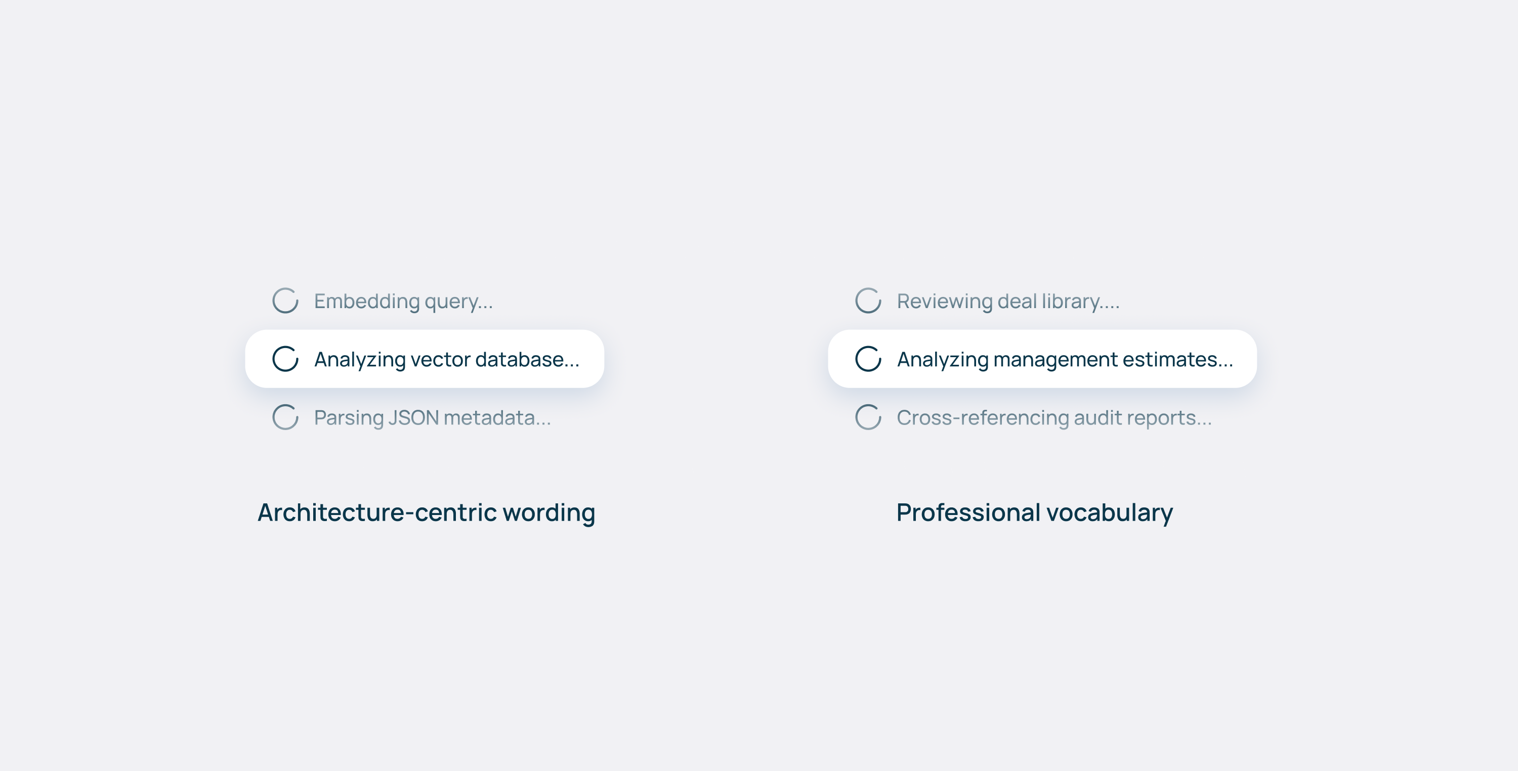
Data on vaults, pipelines, vector stores, and embedding models? That's infrastructure noise to an analyst. The frontend mental model must match the human cognitive model, not the technical architecture.
The same principle applies to language. Instead of "querying database", the UI should say "Analyzing management estimates". Don't talk about golden tables and data pipeline - talk about deal libraries or investment workflows. Use the vocabulary of the profession you're serving, not the one you're building in.
For features that some users need but others don't - like advanced filtering options or data lineage views - consider progressive disclosure. Display what everyone needs upfront, and tuck specialized controls in an expandable panel or settings drawer. The goal is to keep the interface approachable without limiting what's possible.
Human, in the right place in the loop
Complexity also changes depending on whose task we’re talking about, in which stage of a deal. They all carry different risks, so UX patterns must adapt. For low-stakes data extraction—pulling revenue figures from a deck—the AI acts like a junior associate. The UX should be speed-focused: fast inputs, quick outputs, minimal friction.
For high-stakes work, the AI becomes a senior reviewer. Here, the UX should emphasize flagging contradictions, highlighting risks, and surfacing edge cases.
On the deep end, when legal liability enters the picture, the UI must explicitly force a human check-off. Might sound counterintuitive to the principles of “seamless UX”, but this is necessary friction for PE that could save a substantial amount of money for the firm.
All of these interactions call for different UX patterns, but the interaction with the AI itself remains the same. No matter the task, it can be broken down into three phases: how data goes in, how it gets refined, and how it comes out. Let’s put that into a framework!
The input-refinement-output framework
Input: Make it easier to ask the right question
Prompt engineering shouldn't be the user's job. You’re creating a tool for them, together with AI experts and software developers, and it should be tailored to the specific use case, without requiring users to learn a new way to interact.
If an analyst types "compare margins", the system should be able to suggest specificity—"Which margins? Against which comps?" - or offer common variations like EBITDA vs. gross margins.
Better yet, define use cases upfront. If a user wants to benchmark a target, don't make them start from a blank prompt. The chat input could show hints: "Compare to industry peers" or "Analyze margin trends vs. comps". Or, knowing the desired output, the system could preselect relevant data sources.
Most PE firms subscribe to the same databases they use as extra knowledge— if the system knows you're doing a healthcare deal, it could auto-suggest pulling comp data from those sources instead of making you hunt for them.
Refinement: editing isn't optional
AI outputs are starting points, not endpoints. Analysts need to refine, correct, and contextualize. If the AI says a target's revenue is $50M but you know from the auditor’s deck it's actually $48M, you need to fix that in-line - immediately, without leaving the screen.
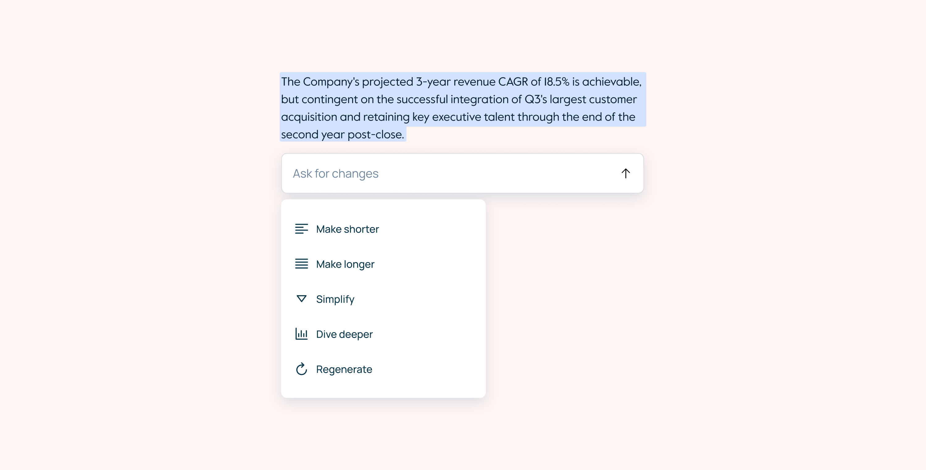
Editing also provides psychological control. The analyst is shaping the AI output instead of just consuming it, essentially working together with a model. That builds trust and ownership over the final work product.
In smarter systems, these edits become feedback. When a user corrects a figure or rewrites a sentence, the system can learn that preference for future outputs.
Output: structure beats conversation
This is where many AI tools fall apart: chat is an interaction pattern, and should not necessarily be a delivery format. So even if it could work well for exploration and refinement, analysts don't want to browse through conversation history when preparing for a meeting—they need structured arguments they can present and defend.
Also, the way the tool presents information matters: a raw insight - "Revenue grew 23% YoY" - is just a number. That same insight with context (benchmarked against comps, tied to a specific management claim, flagged because it contradicts the audited figures) becomes actionable intelligence.
The layout depends on the task
Once you know what output format serves the workflow, the spatial arrangement follows from there. Think about the components in terms of how they'll actually be used.
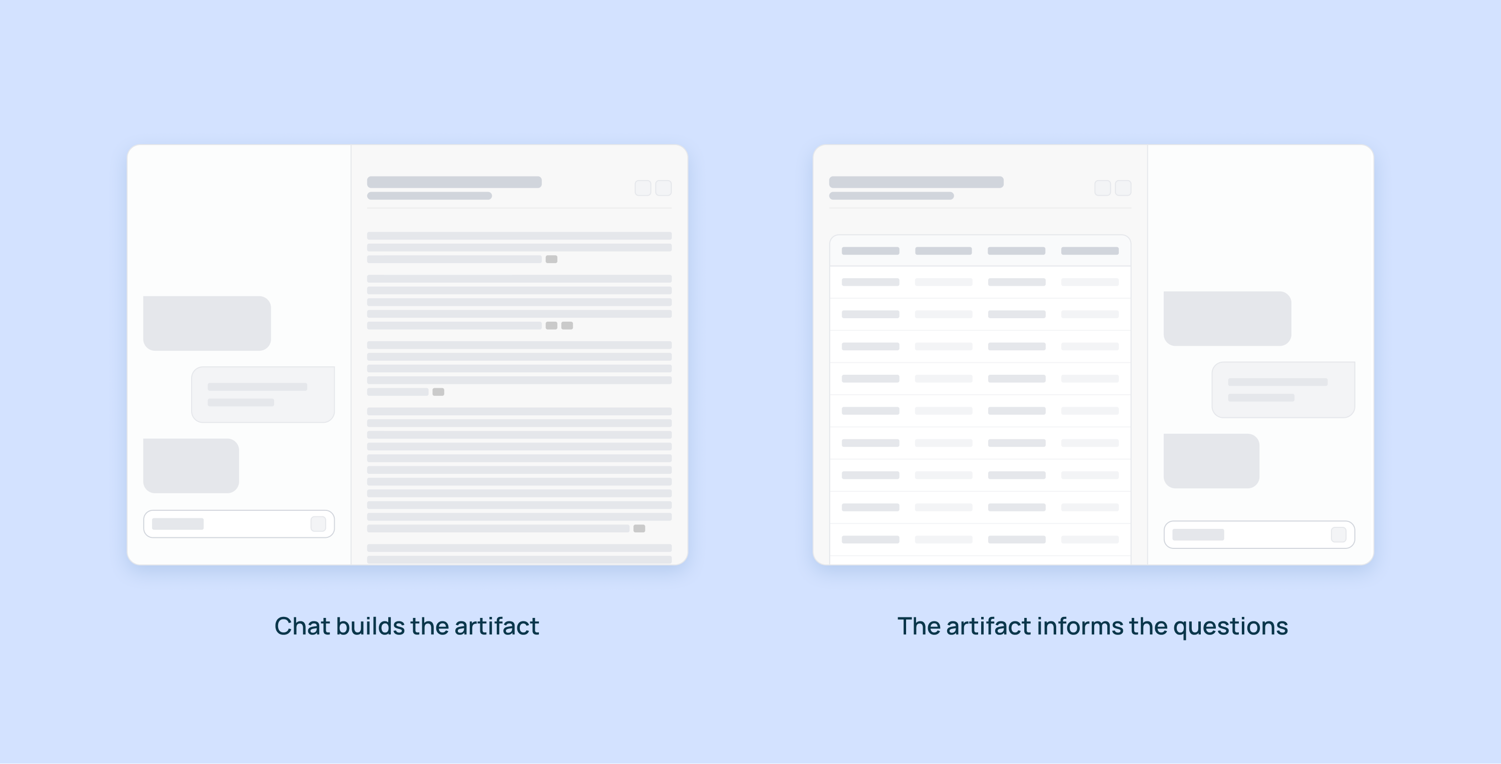
Can you edit the main artifact via chat? If users can add new columns to a grid or new sections to a document through conversation, consider placing chat on the left. It's the primary input method—the thing they interact with first.
But if the artifact itself is the input—like we found with comparison grids where users asked questions about the data rather than building it through chat—then consider placing chat on the right. The grid or document is what they're looking at and referencing, and chat becomes the tool for interrogating it.
For exploratory tasks where conversation is the work product—initial diligence questions, pulling quick data points—chat should be the primary element, with supporting information accessible but not competing for attention.
For review tasks—checking a memo for contradictions, validating assumptions across sources—think about how to surface issues without disrupting the reading flow. Inline annotations, overlays, or side-by-side comparisons each solve different problems. The key is making it easy to see the same data multiple ways: narrative summary, data tables, scenario comparisons. Same insight, different cognitive entry points.
Since firms have people at different levels doing different tasks at different stages of a deal, the interface needs to adapt to what they're trying to accomplish.
Understanding the client is everything
This all comes down to understanding how a specific firm actually operates. Their process, their memo format, their diligence checklist. The better you know these patterns - which tasks need speed, which need validation, which carry legal liability - the better you can design both the output format and the interaction patterns to match.
Since firms have people at different levels doing different tasks at different stages of a deal, the interface needs to adapt accordingly. The AI engine and the UX are inseparable. A brilliant AI with poor UX is a technical capability that no one uses. Slick UX around a weak engine is just a nice interface for bad outputs.
The real work is treating both as a single design problem: how do we make useful intelligence feel natural to work with? Get that right, and AI stops being a novelty and becomes how deals actually get done.