You're worried about your symptoms on a random night, so you look them up online, or double-check a screening invitation, an appointment message or a result in a patient portal. The screen gives you information, but not always meaning.
You may see a number without explanation, an unknown medical term, a risk percentage, a list of side effects, or a sentence that says “abnormal”, “recommended”, “urgent”. What they often do not show is context. Is it common? Is it urgent? Does it apply to me? What should I do next? In the gap between information and meaning, anxiety starts to grow.
As designers, we are not diagnosing, treating, or giving medical advice when designing UX for healthcare, but we shape how people encounter risk, uncertainty, control, and the next possible action.
What Paul Slovic taught us about fear
Psychologist Paul Slovic’s landmark work on risk perception showed that people do not judge risk only through probability. A situation feels more frightening when it is unknown, hard to control, invisible, difficult to understand, or connected to severe consequences.
A familiar example is flying versus driving. Many people feel more afraid on an airplane than in a car, even though commercial air travel is statistically much safer than car travel. Flying feels less controllable. You cannot see every decision being made, and you don’t understand every sound the plane makes. If something goes wrong, the imagined consequence feels catastrophic. Driving feels familiar and self-directed, even when the statistical risk is higher.
The point is not that people are bad at risk; it's that risk is filtered through control, familiarity and imagination.
Healthcare often contains the same ingredients. A medical term can feel unknown, a waiting status can remove a person’s sense of control, or a result label can make something routine feel alarming if it appears without explanation.
A clinician may see 2% and think: “This is rare.” A patient may see 2% and think: “But it can still happen.”
For designers, Slovic changes the question. It is not only "Is this information accurate?" but "How will it feel to the person reading it?"
Part of that feeling is not in the person at all. It is in the wording. The same true fact, phrased two ways, can produce two different feelings.
Framing changes interpretation
This is what Kahneman and Tversky called framing: the same fact, worded differently, changes how we read it. Healthcare communication is full of it. A few examples make it concrete:
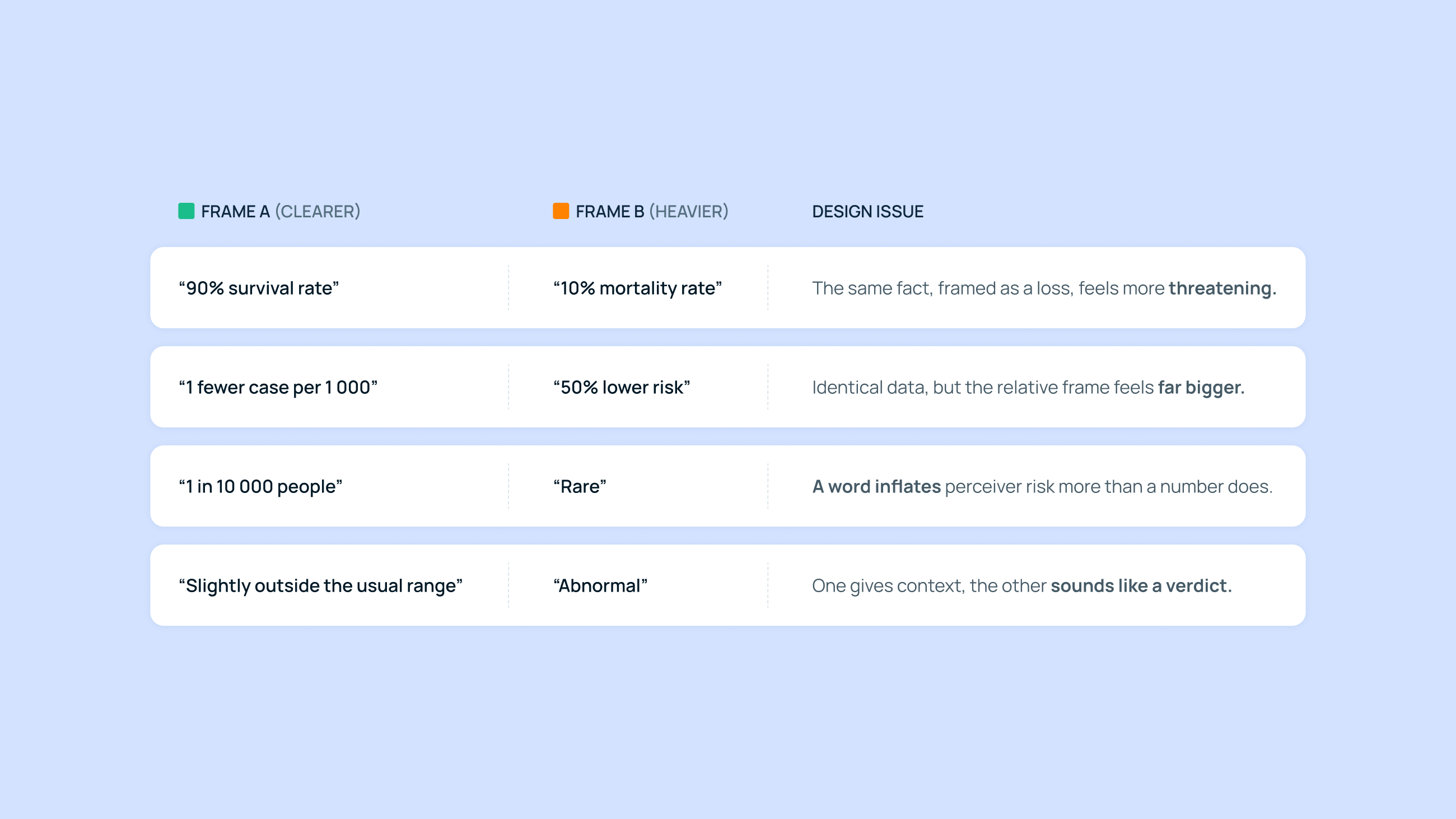
The fact never changes across these rows. Only the wording does, and with it, how heavy the news feels. Words like "positive", "negative", "high", "low", "urgent" and "recommended" have precise meanings inside clinical systems. To a stressed person, they can carry a much heavier emotional charge.
As designers, we don't need to change the clinical fact, but we are responsible for how we frame it.
Under stress, people stop reading
When it comes to UX design in healthcare, interfaces are built for a calm reader, someone who scrolls slowly, weighs the options, and gets to step three after step two. That reader rarely exists because the person on the other side of the screen is often tired, scared, or holding their breath for a result. Under stress, careful reading is the first thing to go. People just scan instead of reading thoroughly. They hunt for answers: is something wrong, do I need to act, and who is responsible?
Vitaly Friedman calls this designing for stress and emergency, and his point is worth sitting with: stress is not an edge case. We have to treat it as a design condition. A screen that sails through a calm usability test can fall apart when the real user is exhausted, in pain, waiting for news, newly diagnosed, or trying to hold it together for someone else.
And when content is unclear in healthcare, the cost can be fear, avoidance, overreaction or a false sense of safety.
The NHS points out that more than 6 in 10 adults struggle with health content that includes numbers and statistics exactly what results and risk messages are made of. Both the NHS content guide and the AHRQ Health Literacy Universal Precautions Toolkit set out how to fix it:
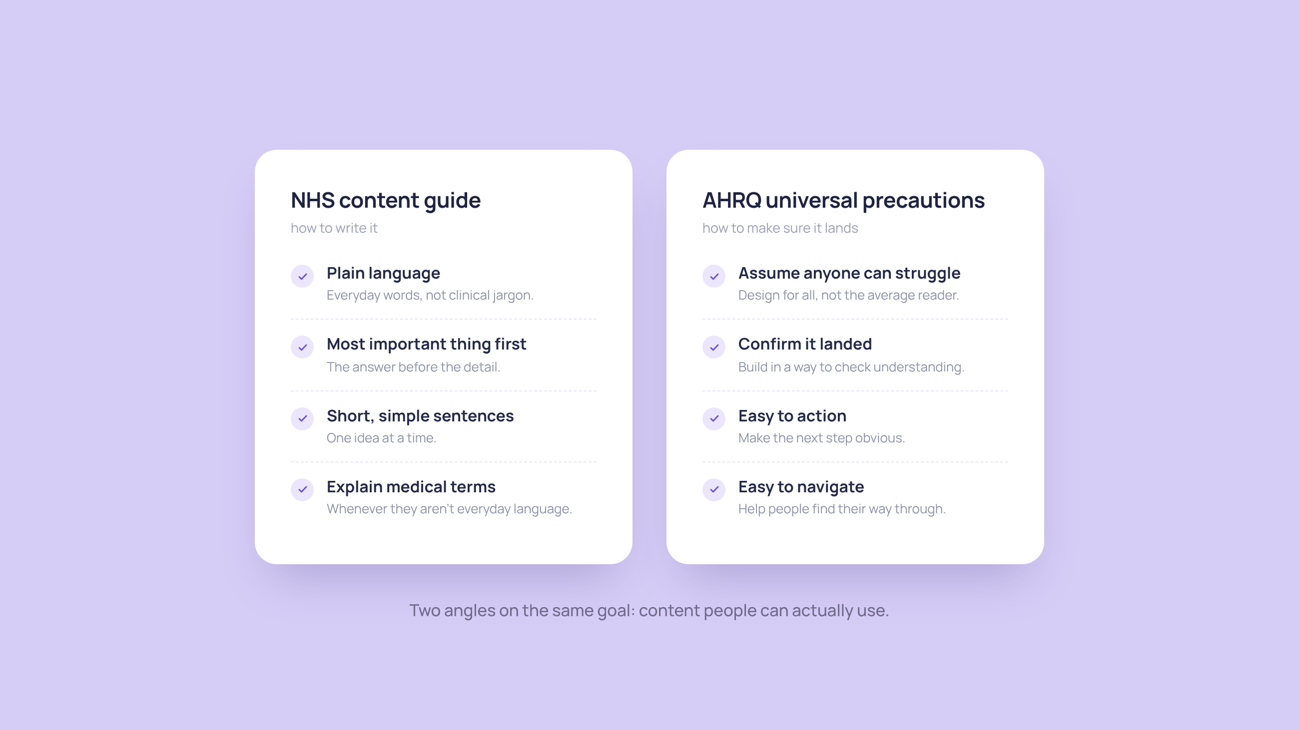
But does clarity work in every situation? Plain language gets the words right, yet the same words don't land the same way in every moment. Booking a yearly check-up for a condition you've managed for years is a very different situation from booking your first appointment after a new diagnosis. Too often the screen treats both the same, even though the person reading it isn't. The pattern we design for clarity has to match the user’s situation.
The question is: where might the person be right now?
Consider another example of healthcare screens being read in different states. A routine prescription refill, a screening invitation, a pending result, a new diagnosis and an urgent symptom path need entirely different communication patterns.
We are not comparing diseases, diagnoses or people. We are comparing situations in which health information is received. The same person moves between them in a single journey: a routine task in the morning, waiting for a result by afternoon, reading about a symptom at night and trying to decide whether they need further help. The design question is always the same: what does this situation ask the user to understand, decide or do?
It helps to lay the common situations side by side:
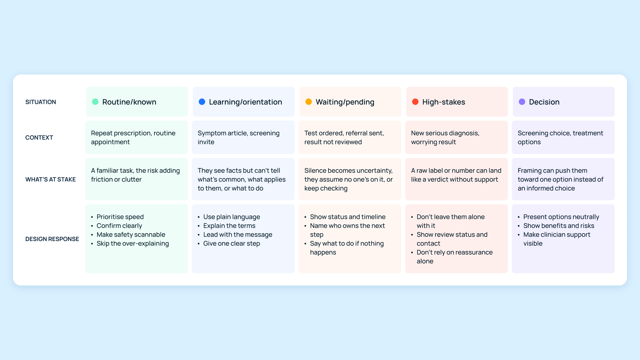
The table sorts situations and possible responses, but a person does not live in one row. They move between states and feelings, sometimes within a single day. The reality can be more tangled than any table admits. This is also why simplifying everything is not the answer: different situations carry different weight.
And the answer is not always on the screen. Sometimes the most useful thing an interface can do is not show something yet, and let a person step in instead.
The NHS App in England is built around this. A serious result is reviewed by a clinician before it appears in the app, and someone reaches out to you first. If something is wrong, you do not meet it alone on a Friday night, left to search and worry through the weekend until someone is free to talk on Monday.
This isn't a decision designers make alone. Whether to hold a result back is a clinical and team question, not a setting in an interface. But it begins with the same question that runs through all of this: where is the user, and how might they feel, right now?
In the era of AI, design responsibility gets bigger
AI can now generate healthcare content in seconds. Give it a brief like "build a screening invitation”, or "design a summary of this condition", and it will produce something fluent, usually a lot of it. But it writes for one imagined reader, someone who stays calm and curious the whole way through. It has no sense of what state the person is actually in, or that the state changes from one moment to the next. It optimises for a complete answer, not the right one for the situation.
In healthcare, that is a real risk. A screen full of fluent, confident information can be exactly wrong for the person reading it, at the moment they read it.
This means we cannot shift the responsibility to the AI; it stays with us, and with the professionals we work alongside. AI can generate the content, but it cannot judge whether it fits the person in front of it. That judgement stays human, and some decisions stay with someone who can make them.
What do you take from all this?
Start with who is on the other side of the screen, not with the layout. The same person is not the same reader from one moment to the next, and the same fact might need one shape in one place and another somewhere else.
None of it is neutral. We decide what a person meets first, and how heavy it feels to read. In healthcare, that might be the work itself.
But it is not ours to decide by design alone. We bring one view, and the healthcare experts we work with bring another: we might lean toward showing something plainly, while they notice how easily it could be misread, or lead a person to a false conclusion that reaches well beyond them. Neither view is the whole picture on its own, which is why a single screen is rarely simply good or bad. These views come together slowly, in hands-on sessions and with frequent feedback, and they always come back to the person reading the screen. These are the things we try to hold onto in our own work.
A few questions are worth keeping close:
- Who are you designing for? A patient, a carer, a clinician, not a generic user.
- What state will they be in? Routine, waiting, a new diagnosis, a decision. The same person moves between them.
- What do they need to understand, and to do next? Lead with what matters, in plain words, and point to a clear step or someone to turn to.
- Where might they get uncertain? Separate what's known, what's unknown, and what's still pending.
- What support do they need? Across literacy levels, accessibility, language and carers. And sometimes a person instead of a screen.
As designers, we should keep asking the painful questions. They decide whether a screen helps a person or leaves them alone with it.