The most dangerous metric in enterprise software is the bypass rate. When a multi-million dollar platform is too "simple" to be useful or too clunky to be trusted, employees will find a way around. They move sensitive financial data into personal spreadsheets, use unvetted AI tools to draft reports, and coordinate mission-critical tasks over private messaging apps.
This Shadow IT is the direct result of a failed user experience, and as such, good B2B UX is a data security strategy.
Designing for business
While there are good cases for security-first UX in B2C products (think of your bank warning you about potential scam calls when opening their app), designing for B2B requires a different approach.
There is value in complexity in an AI tool created for a private equity firm, and guardrails must be in place to ensure compliance regardless of industry, all while also making sure that usability remains a focus. It’s a delicate balance, but this is what can ensure that the path of least resistance for the employee is also the most secure path for the company.
System of record vs. system of work
If your users find the product a hassle to work with, they will simply look for another way to do their job. Unauthorized tools, locally stored data, the list goes on. This is a soft revolt against existing systems and processes, and to understand why this happens, let’s first distinguish between two competing architectures:
- The System of Record: The official database (ERP, CRM, EHR) where the organization stores its "truth."
- The System of Work: The informal space (Excel, Slack, personal notes) where the human actually thinks, calculates, and decides.
B2B UX failure occurs when the System of Record and the System of Work are miles apart. When a tool acts only as a filing cabinet rather than a workspace, users are forced to "leak" data into external tools to make it actionable. Every time a user copies and pastes data into a spreadsheet to "actually see what's going on," your security posture is compromised.
Lowering bypass with a better Time to Confidence
Bypass behavior itself is rarely driven by malicious intent; it is a symptom of low confidence. When a user cannot reach certainty quickly enough on the platform, they seek it elsewhere. This is the gap we define as Time to Confidence (TTC): the duration between a user seeing a data point and reaching the level of certainty required to act.
To manage bypass risk, UX must move the bypass rate from a rhetorical concept to a measurable framework. We track it through three behavioral proxy signals.
With a high export-to-decision ratio (too many CSV/PDF exports occur per "Approve" or "Execute" action), the tool is being used for storage, while the actual analysis is happening elsewhere.
But approval itself can easily sneak off-platform, so we also look for off-platform alignment. If critical approvals happen in private messages before being logged in the tool, there is a lack of trust in the system's collaborative speed.
The last signal is simply manual data re-entry. This is the ultimate red flag of an unusable interface, meaning that exporting into external tracking sheets is not automated.
To close this gap, we must optimize for TTC. Unlike "Time on Task," which rewards speed, TTC rewards certainty.
We measure it through the verification loop: the number of external steps (consulting a PDF, Slacking a teammate, checking a legacy database) a user takes before they feel safe hitting "Confirm."
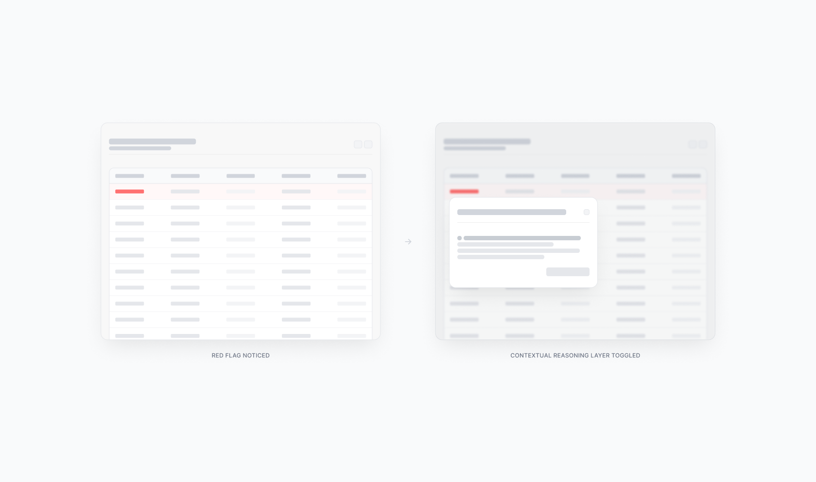
A high TTC means cognitive friction. The user sees a red flag, doesn't trust the dashboard, and spends 15 minutes verifying the data in three other tools. This results in a high bypass rate, data possibly leaving trusted systems, and potential leaks down the line.
In contrast, a low TTC is systemic trust. Upon seeing a red flag, the platform toggles a contextual reasoning layer that surfaces the data's origin and acts immediately, effectively reducing bypass rate to zero.
The tiered cockpit
Lowering TTC requires abandoning the "all-in-one" dashboard in favor of a Tiered Cockpit. This is a role-based architecture designed for specific cognitive modes:
Mission Control (action mode): High information density for the power user. Every variable is visible because every variable is a lever, allowing immediate and direct action. Think of a fintech compliance officer seeing transactional anomalies layered alongside risk scores and sender history on a single, dense screen.
The View-Only Deck (oversight mode): For the stakeholder who needs to validate the "mission." They don't need levers, just the auditability that proves the operator made the right choice. Take, for example, a CFO reviewing a summary of flagged transactions with the reasons behind each approval surfaced instantly.
Strategy in action: the clinical decision
Optimizing for TTC is an essential strategic safeguard for healthcare platforms.
Imagine a doctor reviewing a patient’s health profile. An AI agent that scanned years of messy, unstructured medical reports uncovers a hidden ‘red flag’, a high risk of developing heart disease. The markers look deceptive to the human eye: some warning lights are green, while one of them is deep red.
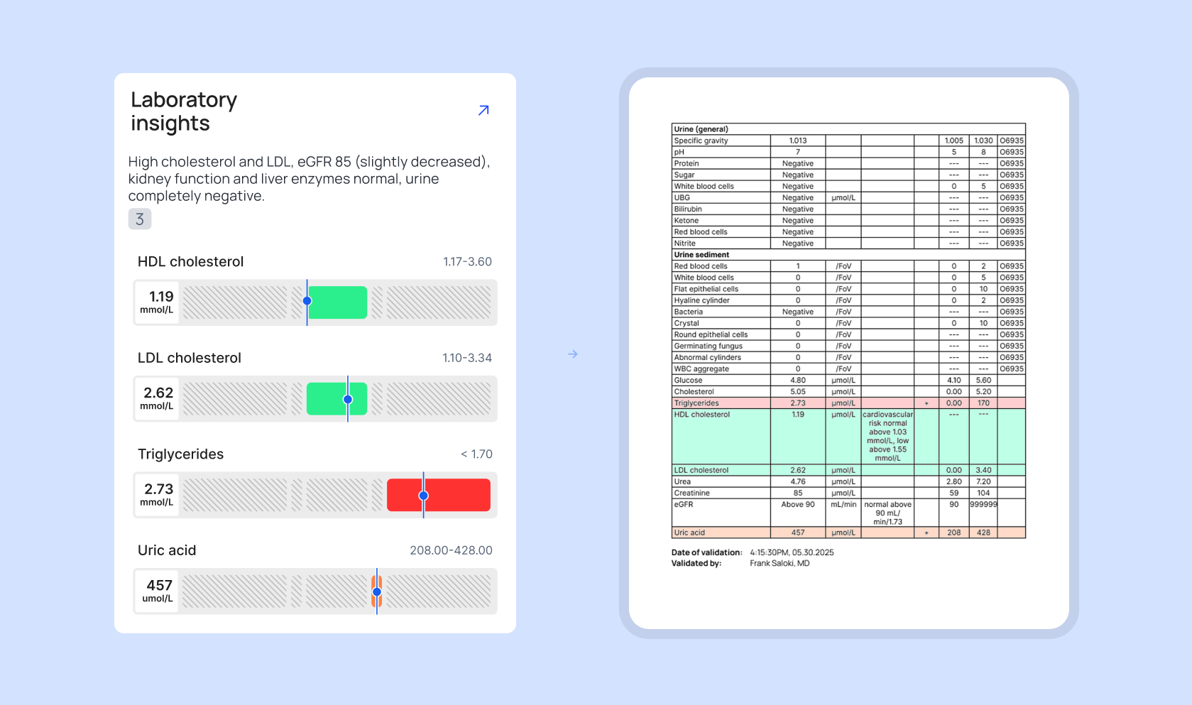
As seen on the illustration, the markers show spiking fats (triglycerides) and dropping “good” cholesterol (HDL). Even though the “bad” cholesterol is still technically in the green safety zone, a separate spike in uric acid confirms a dangerous trend toward arterial plaque and potential heart failure.
In an over-simplified interface, the doctor would only see a generic alert: “Recommendation: Begin preventative heart treatment”. There is no evidence. Because the stakes involve human life, the doctor’s verification loop explodes. Since they don't trust the “black box” summary, they start digging through old medical files to find the original lab results themselves. The expensive software is ignored, and the actual work moves back to the shadows of manual research.
In a cockpit-designed UI, the tool prioritizes auditability. As shown in the example, the system provides a side-by-side view instead of a simple answer. On the left, the AI-driven tool translates complex data into a clear visual summary. On the right, the system presents the original source document, highlighting the exact numbers extracted.
The doctor reached confidence in seconds because the system showed its work. By providing a reference for every data point, we eliminate the need for the doctor to leave the tool. The official path is now the fastest and most trusted path.
AI products: learnability vs. auditability
Due to the nature of generative AI, such tools switch up the traditional UX goal of learnability with auditability. Instead of complexity, one of the most critical factors when choosing to work with AI tools or not is the results coming from a black box.
If your tool makes a suggestion without showing the why, the user will revert to their manual spreadsheet every time. True B2B maturity is building a system where the history and the logic are the primary features of the interface. We must stop asking if users like the interface and start measuring how often they feel the need to leave it.
If you don’t know your bypass rate, you don’t know your security posture. When the tools we build respect the weight of the user’s responsibility, we ensure that the most effective way for a professional to do their job is also the only way the organization can maintain visibility over its own decisions.