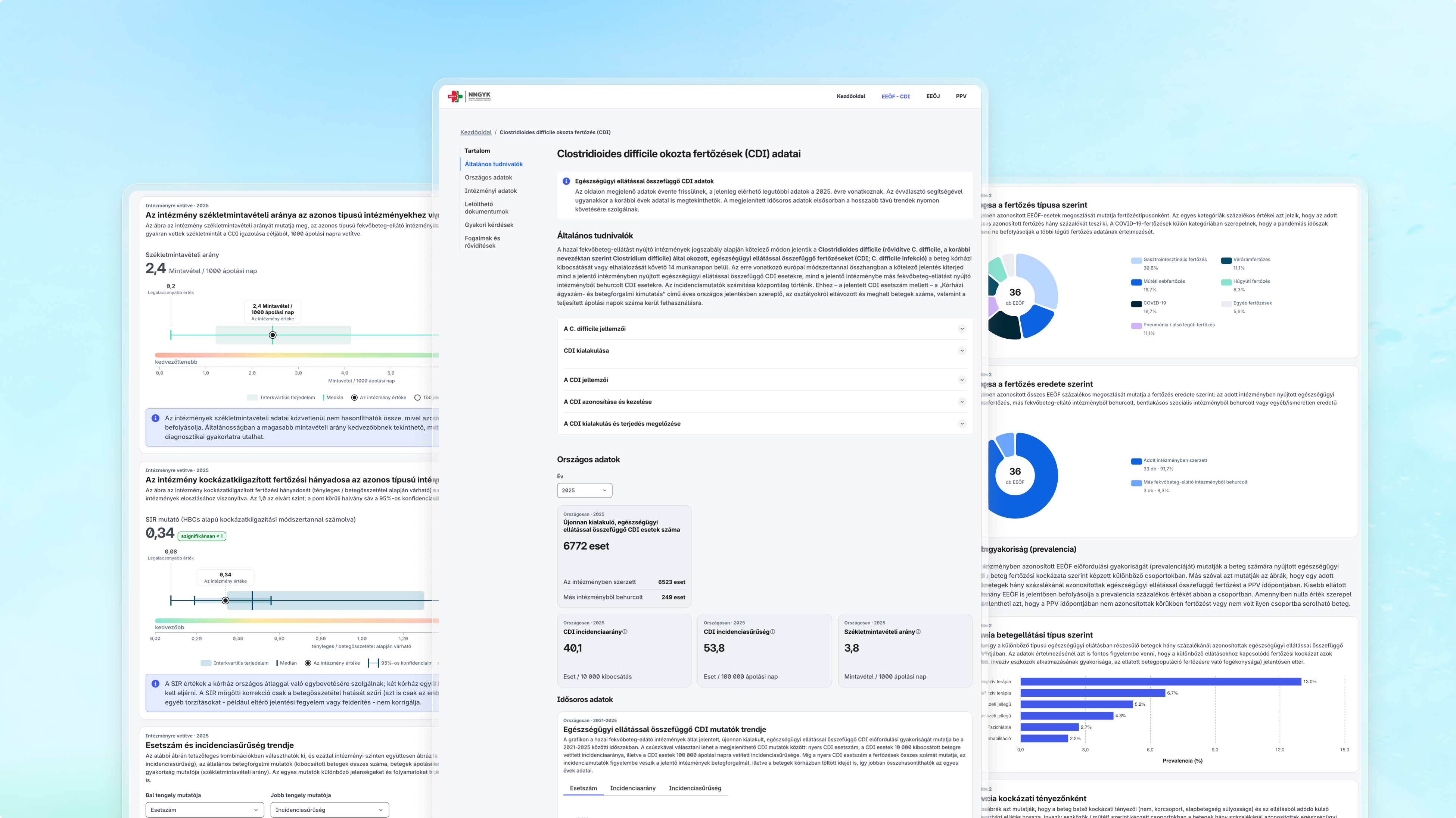
From a July kick-off to a public go-live in September, we had less than 3 months to create NNGYK's public interface for healthcare-associated infection (HAI) data. These are infections patients contract during hospital care, and misrepresenting or misinterpreting such data carries immense consequences, from reputation loss to lower trust in the entire healthcare system.
With that in mind, our job was to collect and consolidate the data domains into a unified structure on a single site, where new indicators can be published into rather than beside.
The hard part was never the numbers themselves. It was making them useful to the hospitals and professionals who work with them, readable enough for the public, and impossible to assemble into a conclusion that isn't true.
I’ll walk you through our main challenges and decision-making points on the design side: the structure underneath it, the charts and colors we chose, the things we took out, and the way of working that made three months enough.
Finding a solid ground in information architecture
In the design phase, we worked with synthetic data based on the healthcare system’s database. This ensured that all information remained private and secure, while we had access to everything we needed to design the final interfaces.
During all this, the first real task was the information architecture itself: which topic belongs under which, their relationships to each other, and what various users take away from the site. An epidemiologist knows what separates an infection from an outbreak, but that isn't the same as deciding where C. difficile sits on a public page, or how a visitor is meant to see that the two are connected at all.
Answering it needed the domain in the room, and it was in ours: Hiflylabs’ biomedical data scientists. Before putting anything in front of the epidemiologist officials, we went through how each indicator behaves. That is why we could draw the relationships between the topics by hand and take that skeleton into the first workshop as the agenda, rather than arriving with a blank page.
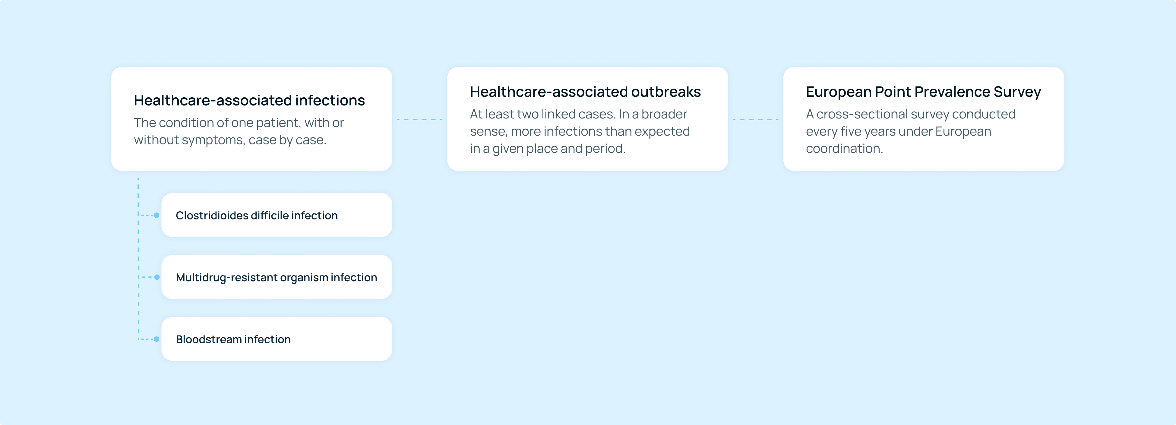
It is also what let us scope the series: once we saw roughly how many panels were coming, we could split them into different categories and say how many workshops were needed. While specific topics, outbreak categorization, or words like C. difficile or point prevalence might not mean much for the average person, these are important details for epidemiologists, so they must be presented.
This categorical breakdown allowed us to start every session after the first with an iterated version rather than a blank page. As a result, the workshops were spent making decisions instead of discovering that half the ideas were unbuildable. On a three-month schedule, expert time is the scarcest thing you have.
Reverse-engineering target groups
In the UX textbook, the target group comes first. But the public, the hospitals, and the professionals are not the same targets, and you notice the difference in the places where you keep getting stuck: how much a given thing has to be explained, and which chart types can be considered at all. Best practice is usually the first thing a designer reaches for, but comparable sites we found mostly publish the data itself, so we had quite a task ahead of us.
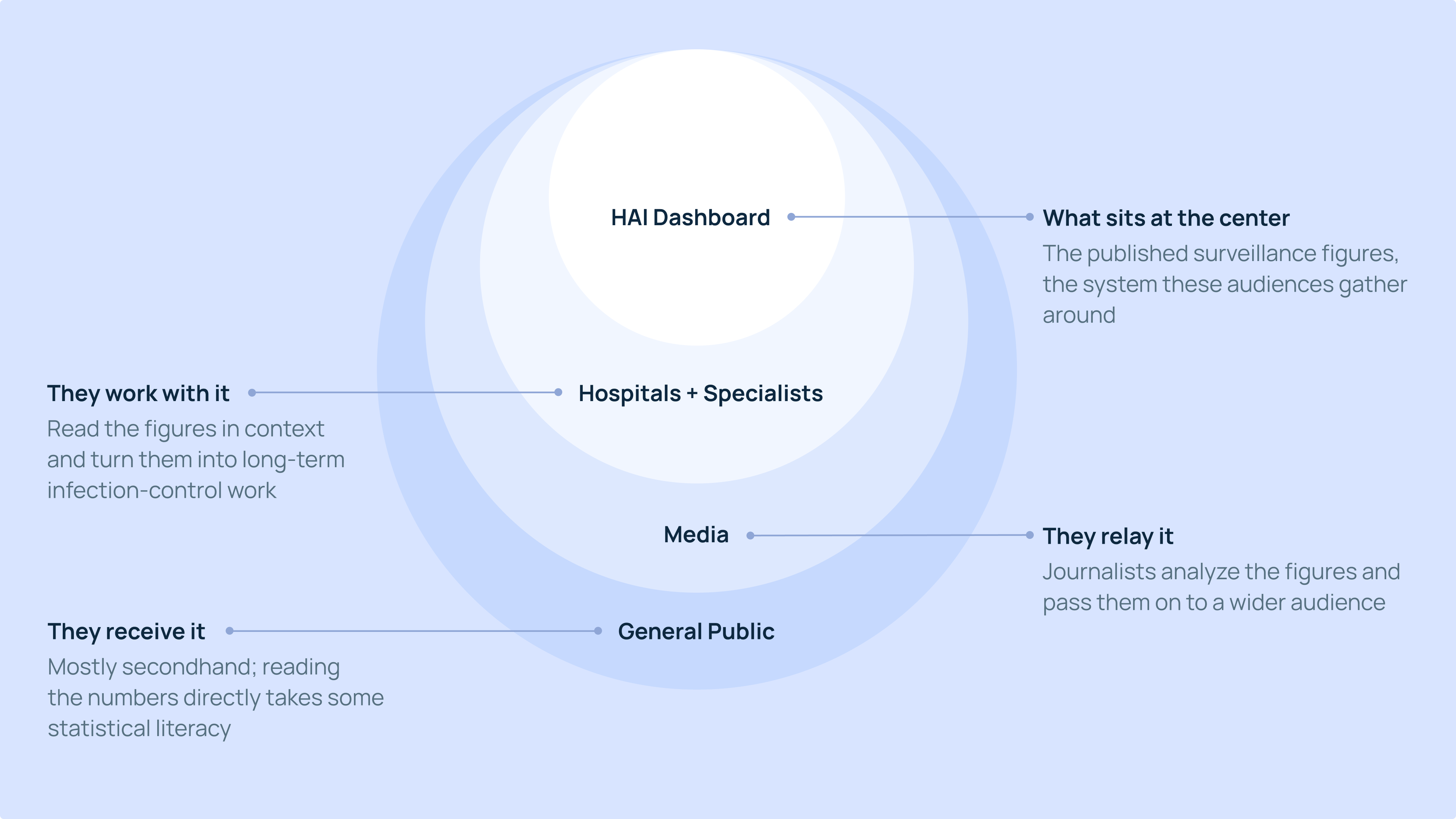
Instead of best practices, we came at it from the other end and asked what we wanted to achieve here: understandable and easy-to-analyze figures and explanations, down to what a given bacterium actually is and what an outlying value means. We stated these basic principles, and once they were on the table we could put the target groups in order: the hospitals and the infection-control professionals first, then the press, who analyze and communicate the figures onward, then the wider public.
Analysis first
One of those principles governed everything after it: this is an analytical surface. It doesn't nudge anyone toward a screening or a decision, and it isn't there to reassure or to alarm. This principle set the direction of everything that came after, because once it is written down, every later idea can be measured against it.
That has a direct consequence for language. There's a standard UX principle that says avoid jargon, and in this domain you can't: Clostridioides difficile is called Clostridioides difficile, and renaming a clinical term to make it friendlier just produces one nobody can look up. What a designer can do is make it legible instead of renaming it.
So we fixed early where explanations are allowed to sit, based on where a reader is actually looking rather than where a glossary would be convenient: a short definition with a character limit where the reader stands, and a fuller layer below it for anyone who wants more. That character limit is what kept it working, because an unbounded explanation slot fills up and starts competing with the data.
Avoiding comparison
To further ensure the analytical nature of the platform, we focused on transparency but without the option to compare and rank.
This is because institutions differ in case mix, and so does surveillance intensity, meaning that comparing raw figures is inaccurate and biased. The published methodology covers this in detail, and it is why the site shows risk-adjusted figures with confidence intervals rather than raw rates alone. It was also discussed in the press when the platform went live.
Downstream from this is the design question of the barriers to comparison. Telling readers not to do something rarely works; it had to be built into the structure instead. There is no view that puts two institutions side by side, and no way to click from one straight to the next. The site moves vertically instead of laterally, from the national picture down to the institutional one, so a reader digs deeper into one level of detail rather than sideways across institutions. Further indicators fit into the same logic instead of needing an arrangement of their own.
The operational value of an agreement like this cannot be overstated. Once a principle is stated out loud, it stops being anyone's taste. When a new idea came up in a later workshop, the question wasn't whether someone liked it, but whether it fit what we had already agreed, and that can be checked in a sentence. This is what kept the work disciplined, and everyone held to it.
Charting the charts
This is a large site with four reporting systems on it, and every new chart form is one more thing a reader has to learn before the numbers mean anything. So the question at every panel wasn't only whether a form works, but whether it earns its place next to the ones already there.
Which chart belongs where was rarely a design call on its own. It follows from what the indicator actually is, and was settled in the workshops with our biomedical data scientists and NNGYK's epidemiologists.
What we brought was how the chosen form is read. A study of graph literacy in health contexts is blunt about where that goes wrong: people lift a value off a chart easily, but on the hardest task (where you have to notice what the axis and the scale are doing), fewer than one in five got it right. ECDC's guidelines for presenting surveillance data, which the epidemiologists pointed us to, were our other reference.
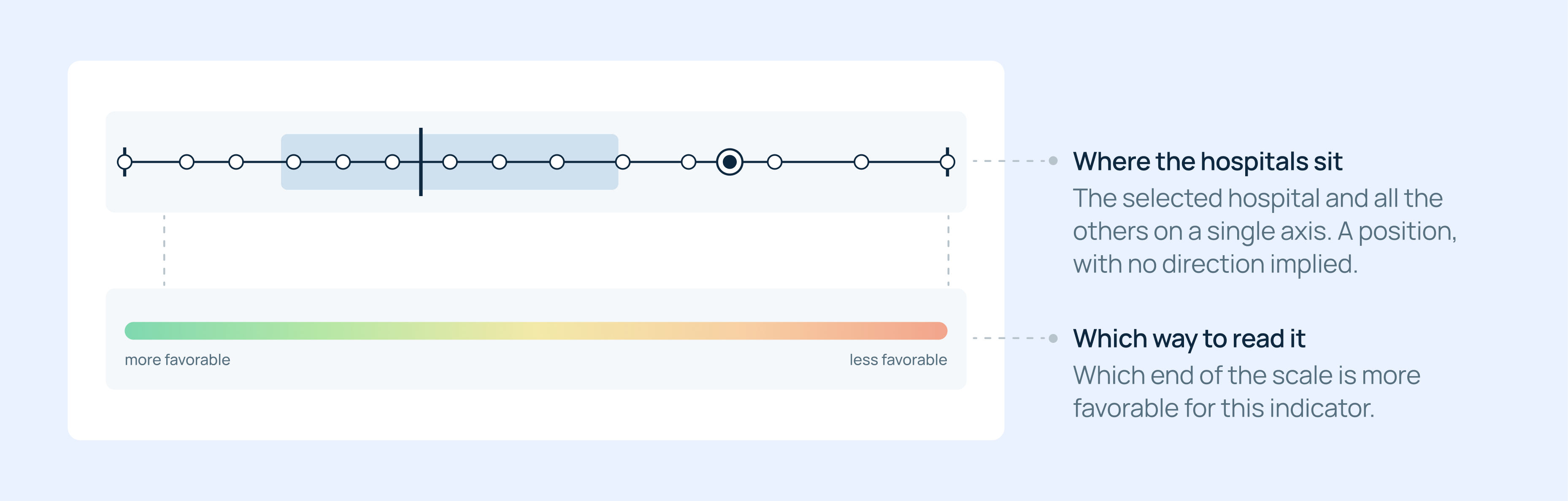
The form we spent the most time on is the boxplot: every institution has a dot on one axis. It answers the question the given institution actually has: whether its figure sits high or low in the field, without naming anyone else.
Reading a boxplot correctly is a different skill from knowing what it is, and that holds even for people who use them professionally, so every chart here explains itself part by part. Research also shows that when shape and scale disagree, readers follow the shape. So a band runs under the plot, putting the scale's direction into the shape itself.
Color works best when it isn't noticed at all
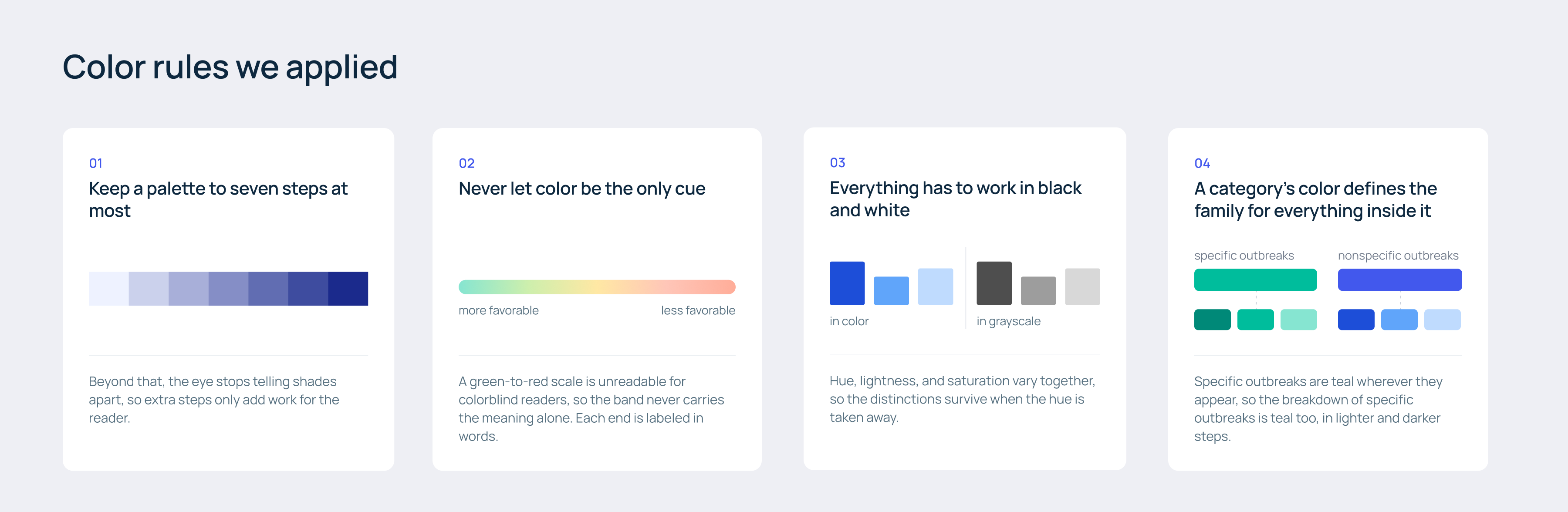
Color is the part of this work nobody notices, and the part whose misuse everyone notices immediately. We found that out from our own prototype: when you iterate this fast, every new chart can turn up with its own colors, and within a few rounds the site can get too loud. So we stopped and wrote down our ground rules.
Once again we followed surveillance data presentation guidelines. These cover color as well as chart choice, down to keeping the number of colors in a figure low rather than handing every category one of its own. Out of that came the two decisions we held to everywhere: one palette built on rules instead of colors picked chart by chart, and everything readable in black and white, so that it remains legible for readers with color vision deficiency.
The rule that mattered most in practice is the smallest one. Within a page, a value keeps its color. If a given figure is blue in one chart, it is the same blue in every chart on that page.
Team integration made it work
None of this would have been achievable in two and a half months on static designs. From the beginning, the interface had a working front end (with synthetic data), built with Claude Code on the official Hungarian Digital Citizen (DÁP) design system, with the charting library wired straight in.
Variations were live, data-driven charts, and we could look at them during the workshop itself. Something agreed in the afternoon was reviewable the next morning, visually and from the data side, so chart decisions were made in behavior and not in a mockup.
The speed came from the roles. Normally a chart idea waits for someone to confirm what the indicator means, for someone else to check whether the data carries it, and for an estimate of whether it can be built at all. From the first workshop, our biomedical data scientists could say what a figure means and what display it will take, so none of the answers were ever more than a day away.
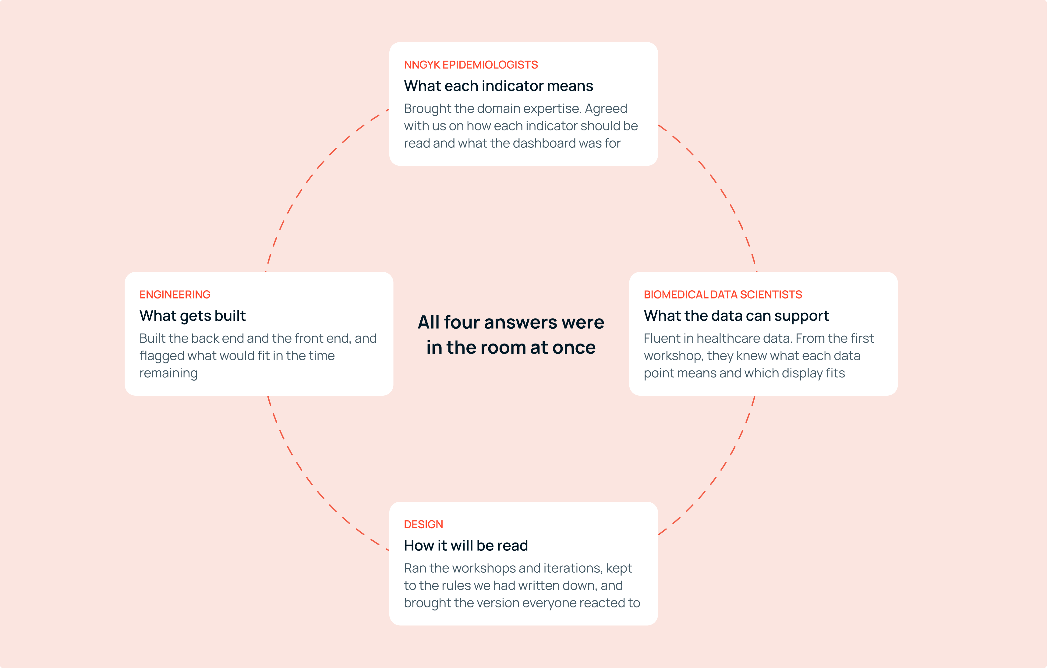
That also answered a question I found hard at the beginning. In a domain this strong, it is not obvious where a product designer fits. It turned out to be in holding the scope: setting the rules, running the iterations and the workshops, and recognizing when something still serves what we agreed and when it has quietly stopped serving it. And the fact that deciding how something would be shown is what made it clearer what had to be prepared to show it. It is the same responsibility I have written about before, in a different context.